Sherwin Williams Agreeable Gray: Where It Works and Where It Fails
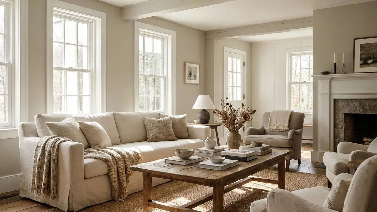
Start with a number: 60. That’s the light reflectance value commonly listed for Agreeable Gray, and it explains most of what goes right and wrong with this paint. Say a homeowner rolls it across a sunny south-facing living room and loves it. Same homeowner, same gallon, north-facing bedroom: suddenly the walls look flat and a little muddy. Nothing changed except the light.
That gap between "looks great online" and "looks great in my house" is why people repaint. A wrong wall color costs a weekend, a few gallons and some pride. So this guide on sherwin williams agreeable gray skips the swatch gallery and gives you decision rules by room, light and finish. This is one part of choosing paint colors for a whole house, and by the end you’ll know where it earns its reputation and where to walk away.
Executive Summary
Sherwin Williams Agreeable Gray (SW 7029) is a light, warm gray that sits between gray and beige. Its reputation as "the safe one" is only half true. It adapts to the room, which is its strength and its risk.
You’ll learn how its LRV of 60 behaves in each exposure, why it can flash purple, green or pink next to the wrong floor or trim, and which bulbs and sheens keep it honest. You’ll also get a trim-white shortlist, a comparison with Repose Gray, Revere Pewter and Anew Gray, and a four-test sampling routine to run before you buy gallons.
The biggest objection is "isn’t gray dated?" Short answer: the cool, flat grays are tired, but in my view a warm greige like this one still reads current. Whether it suits your house depends on your light, not on a trend.
What Is Sherwin Williams Agreeable Gray, and Is It Gray or Beige?
Sherwin Williams Agreeable Gray is a mid-light neutral listed as SW 7029 with an LRV of about 60. It’s a warm gray, often called greige, meaning it blends gray with a soft beige base. Depending on the light and what surrounds it, it can read as gray in one room and beige in the next.
Two design reviews agree on the LRV figure, though the official Sherwin-Williams page wasn’t readable when this was researched, so treat 60 as the commonly listed value and confirm it on the chip.
LRV runs from 0 (black) to 100 (white). At 60, the color sits above the midpoint, so it bounces light around a room without glowing like a white. Think of it as a color with a built-in dimmer switch. A "chameleon" is how designer Pamela Lynn Interiors describes it, and that’s fair.
My opinion: if you want a wall that always looks gray, sherwin williams agreeable gray isn’t it. If you want one that never fights your furniture, you’re closer.
Will Sherwin Williams Agreeable Gray Look Purple, Green or Pink?
Sometimes, yes. Agreeable Gray carries faint undertones that can lean green, violet or pink depending on nearby materials and light. Most rooms never show it. The risk rises beside strongly colored floors, countertops or trim, so always judge it next to the actual surfaces it will live beside.
An undertone is the hidden hue under a neutral, the reason two grays with the same LRV look different. Here it’s subtle, which is why reviewers describe it as balanced rather than loud.
A common version of this problem goes like this. A homeowner pairs the paint with a pinkish granite and a cool white trim. The gray starts reading mauve at sunset, and nobody knows why. The fix is rarely repainting everything. It’s usually swapping the trim white or changing the bulb.
If you’re curious how a green-leaning color behaves in comparison, see how Sea Salt handles its green undertones.
How Does It Look in North, South, East and West Light?
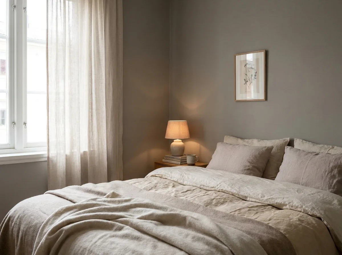
North light makes it cooler and slightly dimmer, south light warms it toward beige, east light is warm in the morning then neutral, and west light turns golden in the evening. Expect a noticeable shift in the same wall between sunrise and dinner time.
| Exposure | What to expect | Decision rule |
|---|---|---|
| North | Cooler, can look drab | Use warm bulbs, go one shade lighter if the room is small |
| South | Warm, closest to beige | Great default, watch for yellow glare |
| East | Warm early, neutral later | Good for kitchens and breakfast rooms |
| West | Golden at sunset | Check it at 5 pm before committing |
The table is a judgment call from designer reviews, not a measured test.
In a dark north room, I’d honestly consider something lighter, or accept the moody look on purpose.
Which Bulbs and Sheens Suit Agreeable Gray?
Use warm white bulbs around 3000K and a flat, matte or eggshell sheen on walls. Bulbs above 4000K push the color cooler, while glossy sheens under recessed lights show every roller mark and wall flaw. Keep shine low unless cleaning demands it.
Kelvin (K) measures how warm or cool a bulb looks. One design reviewer suggests about 3000K, which is a designer opinion, not a lab result.
Sheen is the sleeper issue. One r/paint thread described a homeowner who primed over Agreeable Gray and rolled two coats of satin. Under recessed lights, the finish looked too shiny and exaggerated flaws. Switching to matte helped, but streaks still showed. Commenters pointed to back-rolling and avoiding dry rolling. Others noted flat paint can be tough to clean in homes with pets.
One thread is anecdote, not data. The lesson holds anyway: pick the sheen for the lighting and the traffic, not just the color chip. Eggshell is the usual compromise.
What White Trim Goes Best, and What About Cream and Wood?
Soft, slightly warm whites such as Pure White (SW 7005), Alabaster (SW 7008) or White Dove from Benjamin Moore usually pair well. Avoid cool, stark whites. Cream trim and orange-toned wood can pull the gray toward beige or pink, so test them side by side.
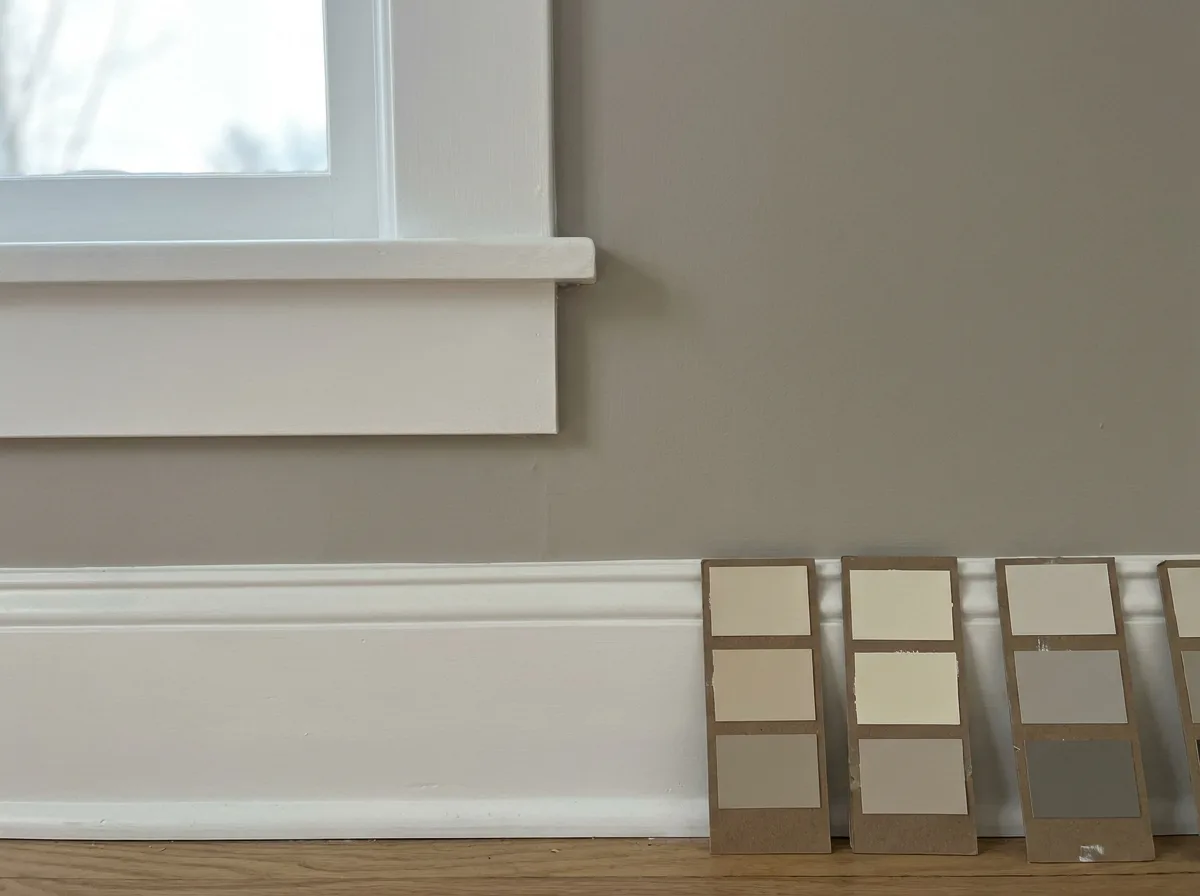
Reviewers don’t fully agree here. A cabinet retailer recommends Alabaster, while one designer calls it borderline too warm next to this gray. That disagreement is useful: it tells you the pairing is taste-dependent. See a closer look at warm-leaning Alabaster trim before choosing, or try a creamier trim option in White Dove.
Incredible White (SW 7028) gets a specific warning from one reviewer for flashing purple-pink beside this gray. I’d skip it.
With orange oak floors, expect the gray to lean cooler and more obvious. That can look crisp or clashy. Hold the floor sample against the wall, not across the room.
Is Agreeable Gray a Good Cabinet Color?
Yes, in kitchens with white or light counters and brushed nickel hardware, it gives a soft, modern look. Success depends on the paint system, not the color. Use a durable cabinet enamel, proper prep and a low-sheen finish that hides brush marks.
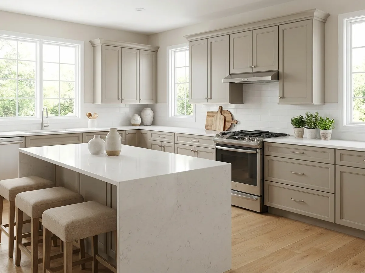
Shaker doors are a common match, and white quartz or marble counters keep the greige from turning muddy.
Cabinets are where DIY goes wrong with this color. They take grease, steam and hands every day, so wall paint isn’t the right product. Sanding, degreasing and a bonding primer matter more than the swatch.
In a home built before 1978, test old paint for lead before you sand or strip it, and use lead-safe practices. Rules vary by location, so check local requirements.
As a typical effort note (not a measured figure), expect a full cabinet job to take several days once you count prep, primer, two finish coats and drying time between them.
My rule: if you’re painting existing cabinets in a busy kitchen, hire a sprayer. If it’s a laundry closet, DIY is fine. For a simpler starter project, check simple painting ideas for a weekend refresh.
Can You Use Sherwin Williams Agreeable Gray Outside?
It can work on siding, but exterior sun changes the look dramatically. Expect it to read lighter and more beige in full sun and darker in shade. Always test on an exterior wall, and use exterior-rated paint, never your interior can.
I couldn’t verify an official exterior LRV, so don’t assume the interior value of 60 holds outdoors.
Say a homeowner paints a south-facing wall and loves the soft greige at noon. On the shaded side of the house, the same color can look closer to a flat concrete gray. Test both sides and the trim together.
If you’re painting masonry or a slab instead, how to paint concrete surfaces correctly covers the prep and product choice.
How Does It Compare to Repose Gray, Revere Pewter and Anew Gray?
Agreeable Gray sits lighter and warmer than Anew Gray, slightly lighter than Repose Gray and brighter than Revere Pewter (Benjamin Moore). Pick it when you want a soft, flexible neutral. Pick the others for more contrast or a different undertone.
LRV figures here come from one designer review, so use them for ranking, not precision.
| Color | LRV | Feel | Pick it if |
|---|---|---|---|
| Agreeable Gray (SW 7029) | 60 | Warm, light greige | You want flexible, soft walls |
| Repose Gray (SW 7015) | 58 | A bit more gray | You want a bit more gray |
| Revere Pewter (BM) | 55 | Deeper, earthy | You want more depth |
| Anew Gray (SW 7030) | 47 | Darker, more taupe | You want a clear step down |
Want real contrast? Pair a neutral wall with a deep contrast color for doors and accents. Cross-brand matching of sherwin williams agreeable gray is a trap: one reviewer warns it changes the color, so buy the real formula from the real brand.
How Should You Sample Sherwin Williams Agreeable Gray Before Buying Gallons?
Use four tests: a large sample, a morning and evening look, your real bulbs, and a neighbor check against floor, counters and trim. Peel-and-stick swatches or painted boards of at least two feet square let you move the color around.
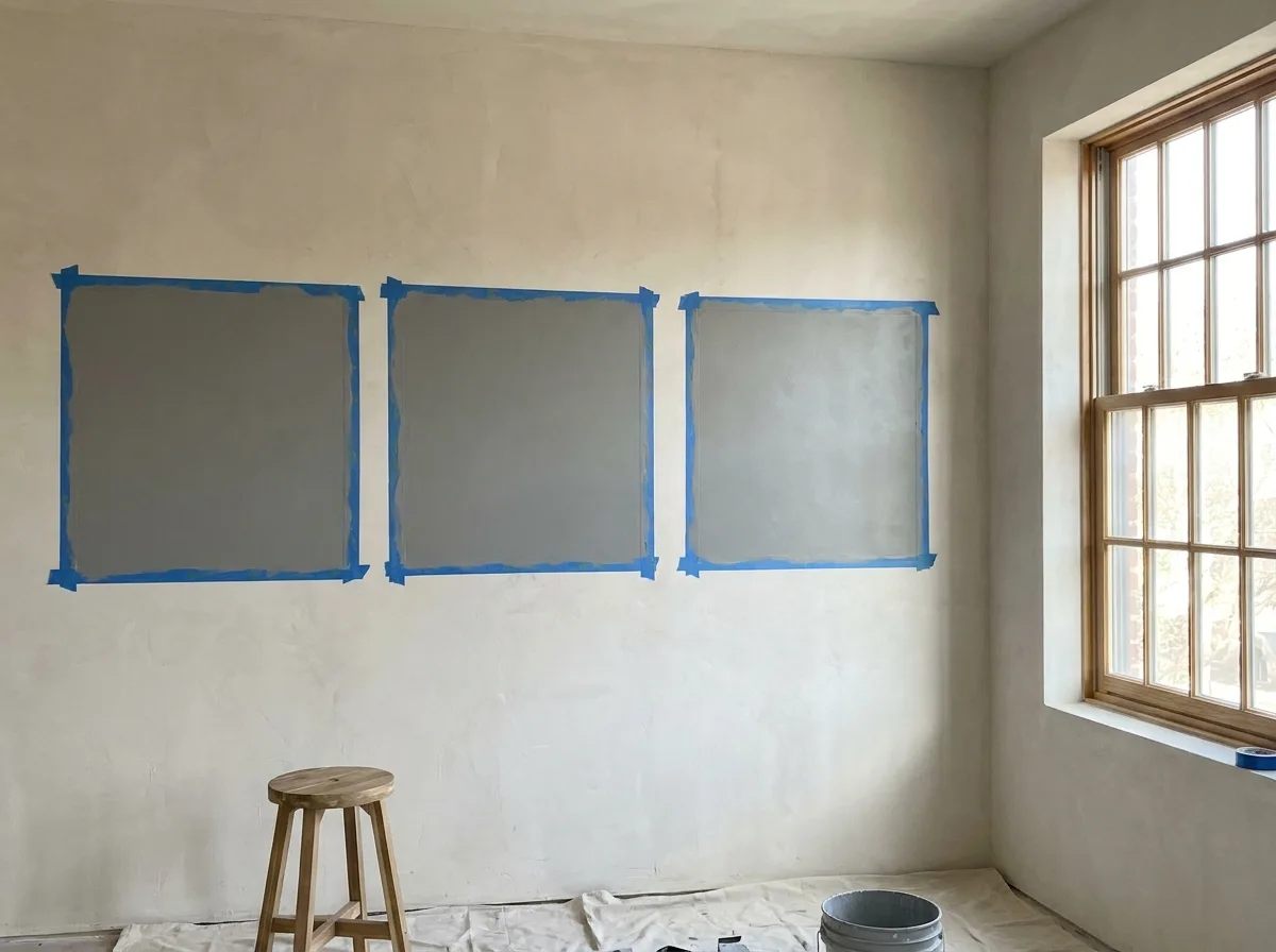
Here’s the routine:
- Size test. Paint a two-foot square on two walls, not a thumb-sized dot.
- Time test. Look once in the morning and once in the evening, on the same day.
- Bulb test. Turn on the actual bulbs you’ll live with, ideally around 3000K.
- Neighbor test. Hold flooring, countertop and trim samples against it.
Sampling sherwin williams agreeable gray is the cheapest insurance in painting. Going over it with a deep color later means priming and extra coats, which is how one homeowner thread ended up with visible streaks. Do the testing first.
When Should You Skip Agreeable Gray, and Is It Still Popular?
Skip it in dark north rooms, beside strongly pink or green materials, and with cream trim you won’t change. It remains widely used, but in my opinion the cool "millennial gray" look feels tired, while warm greiges like this one still read current.
Three red flags for this color: a small windowless room where drab is the risk, a pink stone countertop you won’t replace, and yellowed cream trim you can’t repaint.
On popularity, one Quora answer from a paint seller said Agreeable Gray, Repose Gray and Worldly Gray stayed strong as tastes moved toward grays. It’s anecdote, not a ranking. I wouldn’t chase trends anyway. A color you’ll tolerate for ten years beats one that’s trendy for two.
Frequently Asked Questions
Is Agreeable Gray warm or cool?
It’s a warm gray. The beige base keeps it from feeling icy, though north light can cool it noticeably. Reviewers often place it between beige and true gray. If you want a cooler look, compare Repose Gray in the same room before you commit to gallons.
What is SW 7029?
SW 7029 is the official Sherwin-Williams color number for Agreeable Gray. Use the number when ordering, since names can be confused with similar grays. Ask the store to mix from the original formula, not a color match from another brand. Matching across brands can shift the color, so the real chip is the safer route.
What is the best trim white for it?
Pure White (SW 7005) is a common safe pick, and Alabaster works if you like warmth. Avoid stark or cool whites, and one reviewer warns against Incredible White. Always test trim beside the wall. Our look at Alabaster as a trim option covers how warm it reads.
Is Agreeable Gray good for open-concept homes?
Yes, because it adapts to changing light across a large space. That’s the reason it’s a favorite for whole-house palettes. Check it in every zone, since a sunny kitchen and a shaded hallway will show different sides of it. Keep the sheen consistent so walls don’t look patchy.
Is it good for bedrooms?
It can be, especially in south or east rooms, where the light keeps it soft and restful. North-facing bedrooms may feel dim and drab. Warm 2700K to 3000K bulbs soften it at night. If you want a moodier feel, consider a deeper accent wall instead of painting every surface the same shade.
Does it go with white kitchens?
Yes. White cabinets, white quartz and brushed nickel are the combinations reviewers mention most. The risk is a cool, stark white against warm gray, which can make the wall look dingy next to it. Choose a soft white, then test it against the real cabinet finish and counter before you paint a single wall.
How many coats does it need?
Plan on two coats over a similar light color with primer for big color changes. Going over a deep color usually needs primer first. Back-roll to avoid streaks, and avoid dry rolling. Check the can for the manufacturer’s coverage instead of trusting a rule of thumb.
Can it be color-matched to another brand?
It can, but the result may differ. One designer warns against cross-brand matching because it can change the color. Ask for the actual Sherwin-Williams formula if you can. If you must match, paint a sample and compare it next to the original chip in your own light before buying gallons.
Does it look dingy in low light?
It can, mostly in north rooms with cool bulbs. Myth: a lighter color always brightens a dark room. It doesn’t. Warm bulbs around 3000K and a slightly lighter sheen help far more than switching colors. A deeper tone on purpose can look better than a dim "light" one.
Is gray dated?
Cool, flat grays feel dated to me, but warm greiges like this one still look current. That’s an opinion, not a ranking, and a color you can live with for years beats a trendy one. If you’re unsure about sherwin williams agreeable gray, sample it in your own light first, since your room decides far more than any trend does. Pair it with soft white trim and warm bulbs for the most current look.
Conclusion
Sherwin Williams Agreeable Gray isn’t a "safe" color so much as a flexible one, and that’s a better thing to know. It earns its place in south and east rooms, with soft white trim, warm bulbs and a low sheen. It struggles in dark north rooms, beside pink stone or cream trim.
Back to our homeowner with two rooms and one gallon: the fix wasn’t a new color. It was four sample tests, a warmer bulb and a trim swap. Do the same and you’ll skip the costly repaint.
Your next step is simple: paint two sample squares this week and watch them for a full day. For a darker pairing, read a deep contrast color for doors and accents next. Will your room’s light decide the winner before any trend does?