Sherwin Williams Iron Ore: Where It Works and Where It Fails
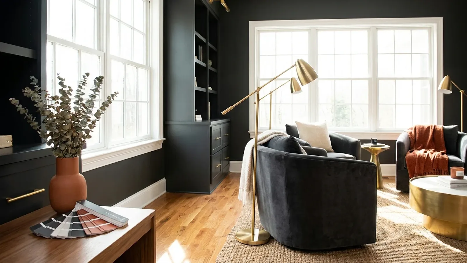
Start with one number: an LRV of 6. That is the light reflectance value the HGTV Home by Sherwin-Williams spec page lists for SW 7069, and it tells you most of what you need to know. On a scale where 0 is pure black and 100 is pure white, Iron Ore sits almost at the bottom. It soaks up light. It hides scuffs. It can also swallow a small room whole.
Say a homeowner falls for a kitchen island photo, buys a gallon of sherwin williams iron ore, and paints the whole north-facing den the same weekend. By Sunday night the room feels like a cave, and the "charcoal" on the wall looks suspiciously brown. Was the chip lying? Not exactly. Dark paint just behaves differently from light paint.
This guide is one part of choosing paint colors for your home, and it is built around decision rules. You’ll see where Iron Ore earns its place, where it fails, and how to test it before you commit. If you want a lighter neighbor to compare, our Sherwin-Williams Alabaster guide shows the opposite end of the scale.
Executive Summary
This article gives you a yes-or-no framework for Iron Ore, so you can decide before you buy a gallon.
Sherwin Williams Iron Ore is SW 7069, the March 2022 Color of the Month. Sherwin-Williams calls it a cool, deep, mysterious charcoal and says to use it sparingly in well-lit spaces or on exteriors. That advice is the whole game.
You’ll learn:
- Why reviewers argue about whether it is warm or cool, and a simple card test that settles it in your own house
- How light direction changes it from soft charcoal to near black
- Where it shines (front doors, islands, one accent wall, some exteriors) and where it fails (small, dim rooms)
- How it differs from Peppercorn, Tricorn Black and Urbane Bronze
- What dark paint adds in coats, prep and sheen decisions
The biggest objection is "won’t it be too dark?" Sometimes, yes. Used as an anchor instead of a blanket, it rarely is.
What color is Sherwin Williams Iron Ore, and is it warm or cool?
Sherwin Williams Iron Ore is a deep charcoal that sits just short of black. The official page calls it cool, while many bloggers see warm, brownish undertones. Both can be true. The undertone you see depends on the light in your room, the sheen, and the colors sitting next to it.
The hex code on that same spec page, #434341, hints at the answer. Those numbers are nearly equal, with a slight lean toward red and green over blue. That is a neutral-to-warm charcoal on a screen. Sherwin-Williams still describes the physical paint as cool. Screens are unreliable here, so treat hex as a rough guide only.
My opinion: stop asking whether sherwin williams iron ore is "really" warm or cool. Ask what it looks like next to your flooring, your trim and your window light. So test it.
How do you test the undertone yourself?
Paint a large sample on a white card, let it dry, and hold it next to pure white paper in your room at three times of day. If it shifts toward brown, your light is warm. If it shifts toward blue or green, your light is cool. Judge it, not the chip.
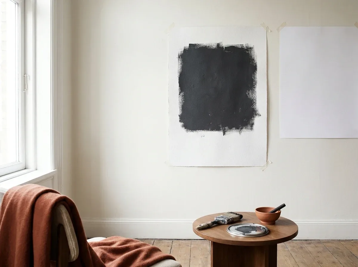
Here is the routine, about 20 minutes of work spread across a day:
- Brush two coats on a white poster board or drawdown card, at least 12 inches square.
- Let it dry fully, since wet dark paint always looks different.
- Tape it to the wall where the color will go, then check morning, noon and evening.
- Compare it against your trim color and your floor.
What does the LRV of Sherwin Williams Iron Ore mean for your room?
LRV, or light reflectance value, measures how much light a paint bounces back, from 0 (black) to 100 (white). With an LRV listed at 6, Iron Ore absorbs nearly all the light that hits it. It will make rooms feel smaller and cozier unless you have plenty of natural light.
In a south-facing room with big windows, the wall glows as a soft charcoal. In a north-facing room, the same paint reads flatter, cooler and closer to black. Artificial light changes it again, since warm bulbs push it toward brown and bright white LEDs push it toward steel.
Here’s a quick decision rule:
| Room light | What Iron Ore does | Verdict |
|---|---|---|
| Large south or west windows | Soft, rich charcoal | Good for walls or cabinets |
| East windows | Cool in the morning, deeper later | Good for an accent wall |
| North-facing or one small window | Heavy, flat, nearly black | Use only for trim or a door |
| Windowless room | Cave-like | Skip, or commit to the moody look on purpose |
I judged each row by how much daylight reaches the wall, the biggest lever you control. Confirm the LRV on your chip before you plan around it.
Is Sherwin Williams Iron Ore a good exterior color?
Yes, Iron Ore works well on exteriors, which is exactly where Sherwin-Williams recommends it. It suits siding, shutters, front doors and metal accents. The main risks are heat and fading on sun-baked walls, so use a quality exterior paint and sample on every side of the house.
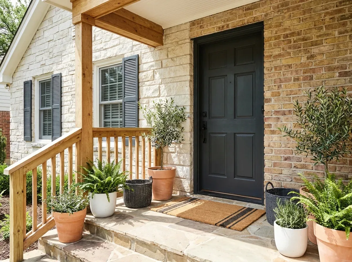
A dark color absorbs more heat. On a south or west wall in a hot climate, that matters for vinyl siding especially, since many vinyl makers restrict dark colors. Check your siding maker’s rules before you buy paint.
It pairs nicely with stone, natural wood doors and warm brick. If you only want a hint, paint the front door and shutters and leave the body alone.
A typical slip is painting the whole house after judging one shaded sample. The fix is simple. Test one patch on the sunniest wall and one on the shadiest, and look at both for a few days.
Can Iron Ore work on kitchen cabinets and islands?
Yes. Iron Ore is a popular choice for kitchen islands and cabinet runs, especially paired with white walls or light counters. It hides fingerprints and crumbs better than white. Use it on an island or lower cabinets first, since all-dark upper cabinets can close in a small kitchen.
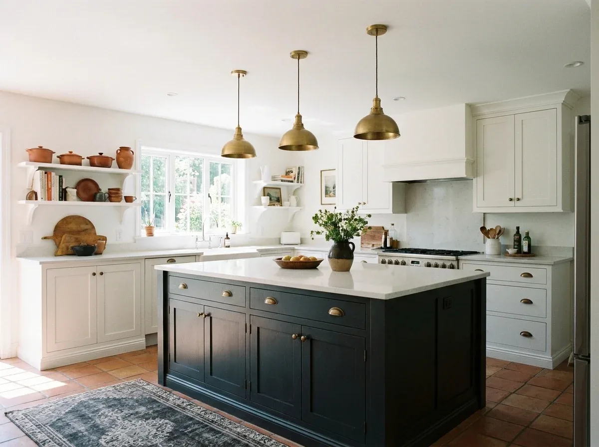
Picture a typical 10 by 12 kitchen with white walls and a window over the sink. Painting only the island in sherwin williams iron ore adds contrast without eating light. Painting every cabinet turns it into a much heavier room. I’d pick the island or the lower run, nearly every time.
Cabinet work is also where dark paint gets honest. Glossier sheens typically show brush marks and dust more, so prep matters: degrease, sand lightly, prime, then apply thin coats. If your home was built before 1978, test old cabinet finishes for lead before sanding, and follow local rules. Our notes on easy painting ideas cover simple prep habits that carry over.
What colors go with Iron Ore?
Pair Iron Ore with clean, slightly cool whites and light grays so the contrast looks intentional. Sherwin-Williams lists Nebulous White SW 7063, Extra White SW 7006 and Cityscape SW 7067 as coordinating colors. Warm woods, brass and stone also sit well beside it.

Treat these as starting points, then sample.
If you want a soft green-gray in the mix, this Sea Salt palette guide helps, and the White Dove trim guide shows how a warmer white behaves next to dark paint.
On trim, very bright white against near-black can look harsh, the "penguin" effect some homeowners complain about in color-scheme threads.
How does Iron Ore compare with Peppercorn, Tricorn Black and Urbane Bronze?
These are the dark neighbors people compare most. The table stays qualitative, so check chips for exact LRVs and color codes, which this guide does not verify.
| Color | Character | Pick it if |
|---|---|---|
| Iron Ore SW 7069 | Soft charcoal, nearly black | You want depth without a true black |
| Peppercorn SW 7674 | Softer, lighter gray | You want a dark gray that feels less heavy |
| Tricorn Black SW 6258 | True, crisp black | You want maximum contrast |
| Urbane Bronze SW 7048 | Brown-leaning dark neutral | You want warmth and wood tones |
Judged by how each reads in dim light, Iron Ore lands in the middle: darker than Peppercorn, softer than Tricorn Black.
Where should you skip Sherwin Williams Iron Ore?
Skip Iron Ore in small, dim rooms, in spaces with low ceilings and little daylight, and anywhere you need a bright, airy feel. Also skip it if you hate visible dust and scuffs on matte walls, or if you plan to sell soon and want a neutral buyer-friendly look.
A common version of this mistake: someone paints a windowless bathroom, hangs one pendant light, and ends up hating the cave. Fixing it means repainting. Resale matters too, since buyers can find strong dark colors polarizing. If you plan a short stay, keep sherwin williams iron ore to a door, an island, or one accent wall.
What does painting dark cost in time and coats?
Dark paint costs more in labor than in material. Expect a tinted primer, two finish coats, and careful touch-ups. Cabinets add sanding, degreasing and curing time. Prices vary by region, paint line and who does the work, so get quotes rather than trusting a rule of thumb.
Gallon prices change by store and product line, so here is the work pattern instead:
- Primer: a tinted primer closer to the finish color helps coverage.
- Coats: two thin finish coats beat one thick one, which can sag.
- Sheen: matte hides wall flaws, satin suits cabinets and doors, semi-gloss suits trim.
- Touch-ups: dark colors show roller marks, so finish a full wall in one session.
How do you color match Iron Ore at another store?
Take a Sherwin-Williams chip or a dried sample card to another store and ask them to scan it, instead of relying on the hex code. Even then, expect small differences between brands, because bases and formulas vary. Always paint a test patch first.
Typing #434341 into a mixer is the least reliable route. Buy a sample to match sherwin williams iron ore, compare it to the original chip, and only then order a full gallon.
Frequently Asked Questions
Is Sherwin Williams Iron Ore black?
No, it is a very dark charcoal, not a true black. With an LRV of 6, it reads as soft black in dim light and as charcoal in bright light. If you want crisp black, Tricorn Black is closer. Hold a sample against black fabric and Iron Ore will look slightly softer, which settles the question fast.
Is Iron Ore warm or cool?
Sherwin-Williams calls it cool, while many reviewers see warm undertones. Both views come from different lighting. North light and LED bulbs push it cooler, while warm bulbs and south light push it toward brown. Test a large dried sample on a white card in your own room at several times of day before you decide which side your house falls on.
What is the LRV of Iron Ore?
Retail pages list an LRV of 6, which is very low. That means it reflects only a small share of light and absorbs the rest. In practice, the paint makes rooms feel smaller and cozier. Confirm the number on your color chip before planning lamps or window light for the room.
Is Iron Ore a good exterior color?
Yes, Sherwin-Williams itself suggests sherwin williams iron ore for exteriors and well-lit spaces. It suits doors, shutters, siding and metal accents. Check your siding maker’s color limits, especially for vinyl, and sample on both sunny and shaded walls. For simple prep habits before any big paint job, see these easy painting ideas.
Is Iron Ore good for kitchen cabinets?
Yes, as long as the room has enough light and you prep carefully. It hides fingerprints better than white, but it shows dust and brush marks, so thin coats matter. An island or lower cabinets often work better than all-dark cabinets in a small kitchen.
What trim color goes with Iron Ore?
Sherwin-Williams lists Nebulous White SW 7063 and Extra White SW 7006 as coordinating colors. A slightly softer white also works if bright white looks harsh. Brass, natural wood and stone make good companions too. Test the trim next to the dark paint in real light.
How is Iron Ore different from Peppercorn?
Iron Ore is darker and heavier, while Peppercorn is a softer, lighter dark gray. If Iron Ore feels too intense, Peppercorn is the easier step down. Put both samples side by side in your own light.
Does Iron Ore need primer?
Usually yes, especially over light colors, bare wood or glossy surfaces. A tinted primer closer to the finish color helps reach full coverage in fewer coats. Over a similar dark color in good condition, you might skip it, but test a patch first. Cabinets almost always need a bonding primer and light sanding before painting.
Can another brand match Iron Ore?
Often, but never perfectly. Stores can scan a chip or a dried sample and mix a close match, but bases, sheens and formulas differ by brand. The hex code alone is the weakest method. Ask for a sample size, apply it next to the original, and compare in daylight before buying a full gallon.
Is Iron Ore too dark for a small room?
Not always, and that is the myth worth busting: small rooms are not automatically off limits. A small room with a good window and a deliberate moody look can feel rich. A small room with no daylight will feel heavy. Light, not size, is the deciding factor, so test the sample before you commit.
Conclusion
Sherwin Williams Iron Ore rewards people who treat it as an accent with a job, not a blanket. Back to the homeowner with the north-facing den: the fix wasn’t a different color, it was moving Iron Ore to the island and front door, and letting a lighter shade carry the walls.
The takeaway is the one the official page already hints at for sherwin williams iron ore. Use it sparingly, in good light, after testing a real sample. My bet is that you will like it more as a deliberate accent than as a gamble.
Your next step is cheap: one sample card and a day of watching it. For a lighter counterpoint, read about a crisp white paint or see how a green-gray handles light.
So which wall in your home actually deserves the darkest color you own?