
Sea Salt Sherwin Williams: Ideas & Styles for Every Room in Your Home
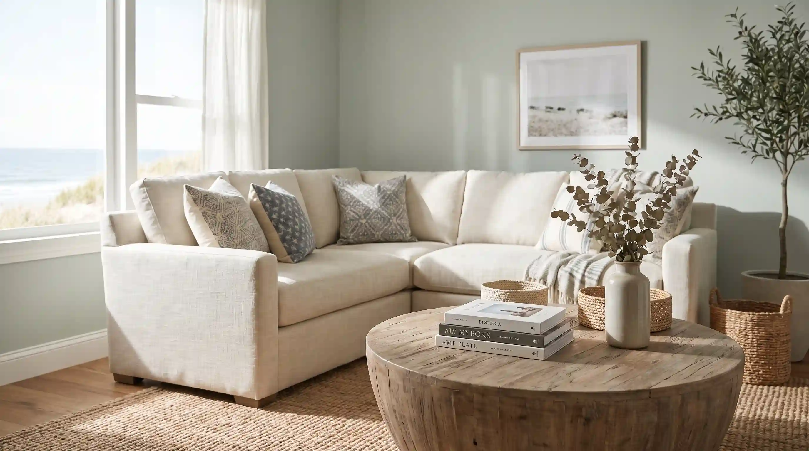
You swipe a sample of Sea Salt Sherwin Williams onto your living room wall, step back, and love it. It reads like a soft, dusty green, calm and a little coastal. Then the sun goes down, you flip on a lamp, and the same wall looks gray. Maybe even blue. You didn’t buy the wrong paint. You just met one of the most talked-about chameleon colors in the Sherwin-Williams lineup, and it does this to almost everyone who tries it.
At At Terrace Place, we get asked about Sea Salt more than almost any other paint color, mostly because people want to know if what they’re seeing online will actually show up on their own walls. Short answer: it depends on your light, and that’s not a dodge. Below, we’ll walk through what Sea Salt actually is, why it shifts the way it does, which rooms it works best in, what to pair it with, what it costs, and the mistakes that turn a great color choice into a repaint six months later.
What You’ll Learn Before You Buy a Gallon
Sea Salt (SW 6204) is a light, cool green with gray and blue undertones, sitting in Sherwin-Williams’ official green paint family and its Top 50 Colors collection. It has a Light Reflectance Value of 63, which puts it in the light-to-medium range, bright enough to open up a small bathroom without going stark. The undertones are genuinely balanced between green, blue, and gray rather than leaning hard in one direction, which is exactly why it reads differently in a north-facing bedroom than it does in a sunny kitchen.
That same flexibility is what makes it popular in coastal, modern farmhouse, and organic modern interiors, and it’s also the reason so many homeowners feel blindsided by it. The fix isn’t a different color. It’s testing it the right way, which we’ll cover in a minute. We’ll also get into real pairing options like Shoji White and Repose Gray, how Sea Salt stacks up against its close cousin Moon Mist, what sheen actually holds up, and whether you can get it color-matched somewhere cheaper than the Sherwin-Williams store.
What Is Sherwin-Williams Sea Salt (SW 6204)?
Sea Salt is one of Sherwin-Williams’ most requested colors, and it’s been a fixture in the brand’s Top 50 Colors collection for years. Technically, it’s classified as a gray-green rather than a true blue, but the coolness of the gray base is strong enough that plenty of people swear it reads blue in their own homes. Both answers are correct, which is part of the appeal.
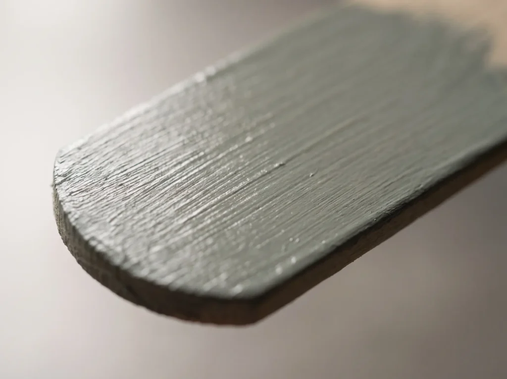
Quick specs:
| Detail | Sea Salt SW 6204 |
|---|---|
| Color family | Green |
| Undertones | Green, blue, gray (fairly balanced) |
| LRV (Light Reflectance Value) | 63 |
| Collection | Sherwin-Williams Top 50 Colors |
| Common uses | Walls, cabinets, exteriors, ceilings |
An LRV of 63 means Sea Salt reflects a moderate-to-high amount of light. That’s brighter than a true sage green like Evergreen Fog, so it feels airy rather than moody, but it still has enough pigment to register as an actual color instead of a tinted white.
Is Sea Salt Blue, Green, or Gray? Here’s the Real Answer
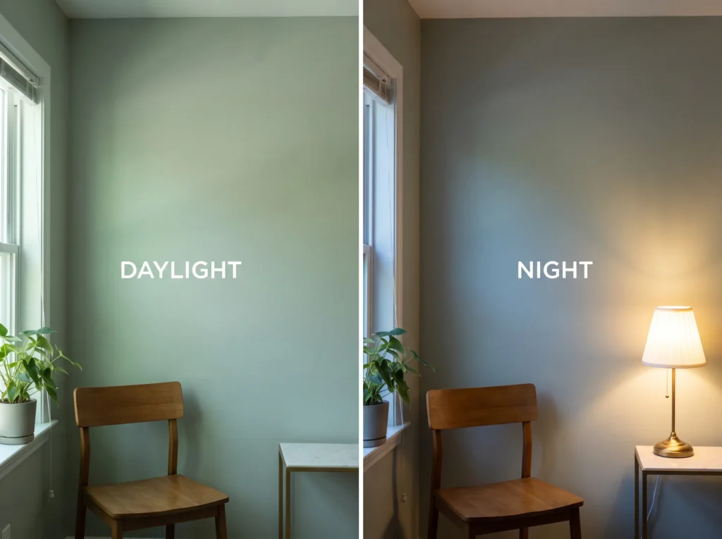
This is the single most common question we see about this color, and it comes up constantly in home decorating forums, with threads specifically debating whether the paint “looks blue” once it’s actually on the wall. The honest answer is that Sea Salt carries all three undertones at close to equal strength, which is unusual. Most neutrals have one dominant undertone and a faint secondary one. Sea Salt doesn’t pick a lane.
In daylight, especially in a room with southern exposure, the green tends to come forward. Under warm incandescent bulbs in the evening, the gray and blue take over and the color reads cooler and moodier. North-facing rooms tend to amplify the blue-gray side all day long, while LED lighting tends to sharpen the gray and fluorescent lighting can wash it out slightly. None of this is a flaw in the paint. It’s just how a genuinely multi-undertone color behaves under different light sources.
Why Sea Salt Looks Different in Every Room You Paint
A common mistake people make with Sea Salt is choosing it from a 2×3 inch chip at the paint counter and assuming that’s what they’ll get on a 12-foot wall. A small chip under store fluorescents tells you almost nothing about how a color with three competing undertones will behave in your actual space. The consequence shows up in complaint threads all the time: someone paints an entire room, hates it by lamp light, and assumes they picked the wrong color when they’d actually just skipped the testing step.
The fix is simple and worth the extra day or two. Get a large sample, at least a 12×12 inch peel-and-stick swatch from a service like Samplize rather than a small painted chip, and move it around the room. Check it in the morning, at midday, and again after dark with your lamps on. Hold it next to your flooring, cabinets, and any fixed finishes that aren’t changing. If you only have one shot at getting this right, this is the step that protects it.
The Best Rooms for Sherwin-Williams Sea Salt
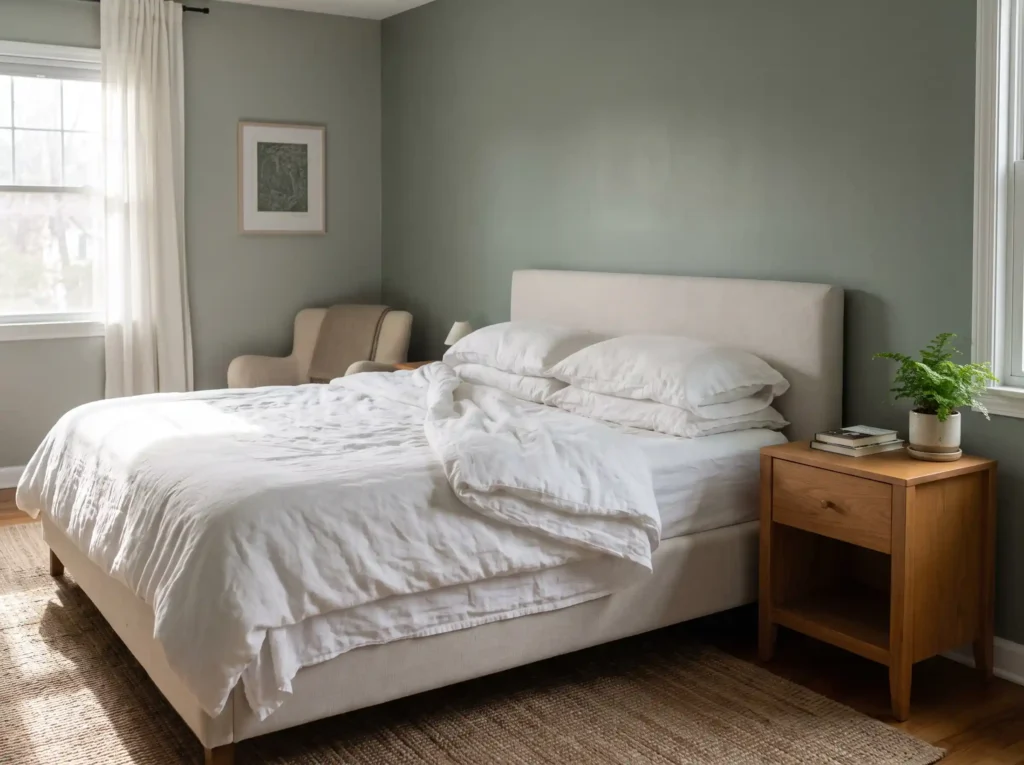
Sea Salt shows up most often in bedrooms, bathrooms, and open living spaces where people want a quiet, cool backdrop that doesn’t feel clinical. In a primary bedroom, it tends to lean calm and spa-like, especially paired with linen or driftwood tones. In bathrooms, the higher LRV keeps a small, windowless space from feeling closed in, while still giving it more personality than a plain white. Living and dining rooms with good natural light tend to show off the green side most, which is usually the effect people are chasing when they pick this color in the first place.
Ceilings are a less obvious but increasingly common use. A Sea Salt ceiling in a room with white trim and warm wood tones can soften a space without the stark contrast of a bright white ceiling.
Sea Salt on Kitchen Cabinets: What to Know First
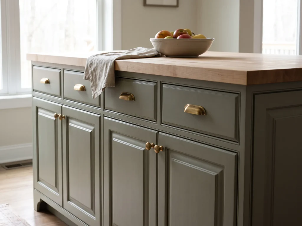
Cabinets are a bigger commitment than a wall, and they show Sea Salt’s undertones differently because of the shadows, angles, and hardware involved. On a flat wall, the color can look soft and easygoing. On cabinet doors with raised panels, shadow lines pull out more of the gray, which can read a touch cooler and flatter than homeowners expect. If you’re not ready to commit your whole kitchen, start with an island or a single bank of lower cabinets rather than the entire kitchen, and choose hardware that supports the undertone you actually want to show, warm brass to soften it or brushed nickel to lean into the cooler gray.
Best Trim and Coordinating Colors for Sea Salt
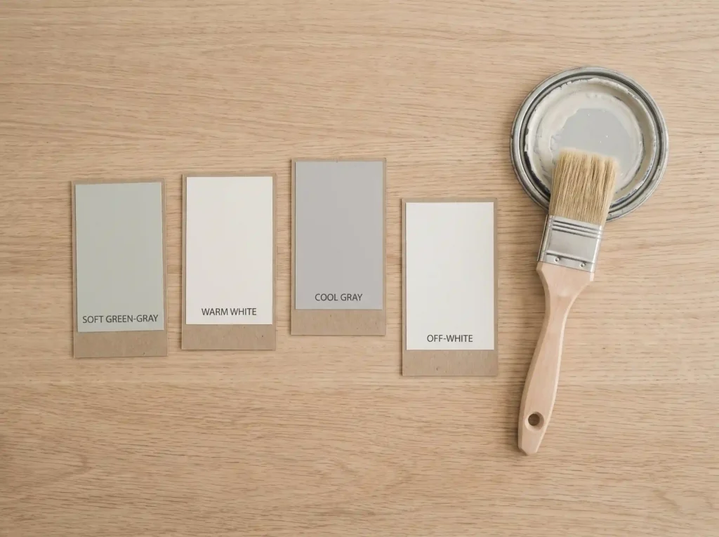
Sea Salt pairs well with warm-toned neutrals for contrast and true cool whites for a cleaner, more contemporary look. Popular trim choices include Sherwin-Williams Alabaster for a softer, slightly warm frame, or Pure White for something crisper. For deeper accents, Iron Ore and Hale Navy both show up often in Sea Salt rooms that want real contrast, and a muted sage like Softened Green works well for layering multiple greens in the same space.
Sea Salt and Shoji White: A Popular Whole-Home Pairing
If you’re trying to carry one wall color through several connected rooms, Sea Salt and Shoji White is one of the more common combinations designers reach for. Shoji White is a warm, greige-leaning white that softens Sea Salt’s cooler undertones instead of fighting them, which makes it a natural choice for trim, ceilings, or an adjoining hallway where you want flow without repeating the exact same color everywhere. (Internal link: At Terrace Place’s Shoji White Sherwin-Williams guide, once published.)
Repose Gray as a Cooler Coordinating Neutral
For a slightly different effect, Repose Gray works as a coordinating neutral in adjacent rooms when you want something that leans more gray than Shoji White’s warmth. It’s a popular choice for open-concept homes where Sea Salt lives in the main living area and a quieter, more neutral gray carries into a hallway or home office nearby. (Internal link: At Terrace Place’s Repose Gray Sherwin-Williams guide, once published.)
Sea Salt vs. Sherwin-Williams Moon Mist: How They Actually Compare
Sea Salt and Moon Mist (SW 9144) get compared constantly, and it’s an easy mix-up since both sit in Sherwin-Williams’ green-gray territory. They’re not the same color, though, and the difference matters once you’re standing in your own space.
| Sea Salt (SW 6204) | Moon Mist (SW 9144) | |
|---|---|---|
| Undertone balance | Green, blue, gray, fairly even | Leans more clearly green |
| Overall feel | Shifting, chameleon-like | More stable and predictable |
| Best fit | Rooms with varied light through the day | Rooms where you want a consistent green |
If the idea of a color that changes throughout the day sounds stressful rather than charming, Moon Mist is the steadier option. If you like the idea of a wall that has some personality and reads a little differently morning to night, Sea Salt is the more interesting pick.
What Sheen Should You Use With Sea Salt?
For walls, an eggshell or satin finish is the standard choice, and satin is worth the small upcharge in bathrooms, kitchens, and hallways where you’ll be wiping down walls regularly. Flat sheens can look beautiful on a feature wall or ceiling where durability matters less, but they show marks faster in high-traffic spaces and don’t hold up as well to cleaning. On cabinets, most painters recommend a step up to satin or semi-gloss, since cabinets take far more daily handling than a wall ever will.
Can You Get Sea Salt Color-Matched at Home Depot or Lowe’s?
Yes, most Behr, Valspar, and Glidden counters can color-match a Sherwin-Williams formula, including Sea Salt, and Behr’s own Salt Glaze is frequently cited as one of the closest off-the-shelf dupes available. Keep expectations realistic, though. A color match gets you very close, not identical, since every brand’s base and pigments behave slightly differently. If you’re only painting an accent wall or a small bathroom, a close match from a big-box store can be a genuine way to save money. If Sea Salt is going across an open-concept main floor where any inconsistency between rooms would stand out, buying the real Sherwin-Williams formula throughout is the safer call, even at a higher per-gallon price.
Sea Salt for Exteriors and Front Doors
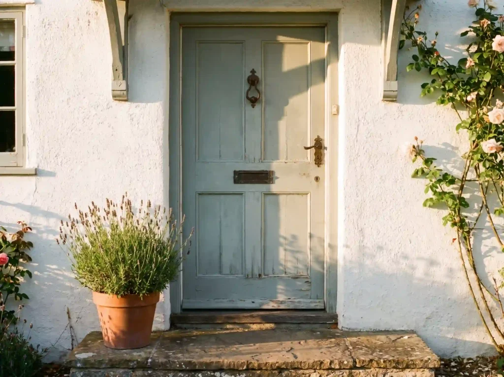
Sea Salt’s coastal, gray-green character makes it a natural fit for exteriors, particularly on craftsman and cottage-style homes where a muted green siding pairs well with white trim and a stone or brick foundation. It’s also a popular front door color on houses with a neutral gray, white, or beige exterior, since a Sea Salt door adds color without clashing the way a bolder tone might. Just remember that exterior paint sees far more sun exposure than an interior wall, so expect the green to dominate more consistently outdoors than it does inside.
Sea Salt Paint Color Ideas by Design Style
Sea Salt adapts to more design styles than its “coastal” reputation suggests.
- Coastal: the obvious pairing, especially with white shiplap, rope or jute textures, and driftwood-toned furniture.
- Modern farmhouse: works well as a cabinet color paired with brass hardware and butcher block counters, softening the usual black-and-white farmhouse palette.
- Organic modern: pairs naturally with curved furniture, boucle textiles, and warm wood tones for a calm, grounded feel.
- Transitional: a safe wall color for homes that mix traditional millwork with more current furniture, since its muted tone doesn’t compete with either style.
How Much Does It Actually Cost to Paint With Sea Salt?
A gallon of Sherwin-Williams interior paint in the Sea Salt tint typically falls somewhere between roughly $70 and $110 depending on the product line and sheen, with premium lines like Emerald running toward the higher end. Most standard bedrooms or bathrooms need one to two gallons for two coats. Material costs across the industry have been trending upward, with 2026 tariffs on materials like aluminum and other inputs adding real pressure to project budgets generally, so it’s worth checking current in-store pricing rather than assuming last year’s numbers still hold.
If you’re deciding between DIY and hiring a painter, walls are usually a reasonable DIY project for anyone comfortable cutting in clean lines. Cabinets are a different story. The prep work, including proper cleaning, sanding, and priming, matters more than the paint itself, and a rushed cabinet job is one of the most common sources of regret we hear about. If you’re not confident in that prep work, a professional cabinet painter is often worth the added cost.
Common Mistakes to Avoid With Sea Salt
The setup is almost always the same. A homeowner falls for a photo of Sea Salt online, buys a gallon based on the small store chip, and paints an entire room in a weekend. The mistake is skipping the large-sample, multi-lighting test described earlier, especially in a room with unusual light, like a north-facing bedroom or a space lit mostly by LEDs. The consequence is a wall that looks noticeably grayer or bluer than expected, sometimes enough to prompt a full repaint within the year. The rule of thumb worth remembering: test any chameleon color like Sea Salt over a full day, in your own light, before you commit a whole room to it. It costs a sample and a little patience. It saves an entire repaint.
Frequently Asked Questions About Sherwin-Williams Sea Salt
What is the LRV of Sherwin-Williams Sea Salt?
Sea Salt has a Light Reflectance Value of 63, which is a light-to-medium range that brightens a room without looking stark or overly pale.
Is Sea Salt more blue or more green?
Technically it’s classified as a gray-green, but its blue and gray undertones are strong enough that many homeowners see it as blue-green depending on their room’s lighting.
What sheen works best for Sea Salt walls?
Eggshell or satin for most walls, satin or semi-gloss for cabinets, and flat only for low-traffic surfaces like ceilings or accent walls.
What’s a good trim color for Sea Salt?
Alabaster is a popular warmer option, while Pure White gives a crisper, more contemporary contrast.
Does Sea Salt work well in small bathrooms?
Yes. Its LRV of 63 keeps small, low-light bathrooms from feeling closed in, while still adding more character than a plain white.
Can I get Sea Salt color-matched at a different paint store?
Most major retailers can match it closely, with Behr’s Salt Glaze often cited as one of the closest dupes, though an exact match across brands is never guaranteed.
Is Sea Salt a good choice for kitchen cabinets?
Yes, though it reads cooler on cabinet panels than on flat walls due to shadow lines. Testing on an island or single cabinet run first is the safer approach.
How does Sea Salt compare to Sherwin-Williams Moon Mist?
Moon Mist leans more consistently green and behaves more predictably across different lighting, while Sea Salt shifts more noticeably between green, blue, and gray throughout the day.
Final Thoughts
Sea Salt earns its popularity honestly. It’s one of the few Sherwin-Williams colors that genuinely changes personality with the light in your home, which is exactly what makes it feel alive in person and exactly what trips people up when they only judge it from a tiny store chip. Test it properly, in your own light, over a full day, and pair it with a trim color that actually complements the undertone you want to show, and it’s a genuinely hard color to get wrong.
If you’re weighing Sea Salt against a warmer neutral like Agreeable Gray or a crisper white like Pure White for the same space, that’s worth its own side-by-side before you buy a single gallon. Which room are you considering it for, and what’s the lighting like in there through the day?